
France Science, brand for French scientific diplomacy
Context Since October 2022, I have been working on a graphic charter to provide a modern and dynamic image of the activities of the Office for Science and Technology at the Embassy of France in the United States. To ensure graphic consistency in its media communications, we designed a more attractive and cohesive logo that effectively conveys the organization's symbols and values.
Visual identity France Science communicates several messages:
- The colors of the French flag and the Marianne font, reflect our affiliation with the French public service (see the new graphic charter for government communication in France, created in 2020);
- A series of values motivate our actions on American soil:
* science and technology,
* excellence and innovation,
* bilateral exchanges and the connection between the two countries,
* movement and mobility;
* The hexagon on the "i" of the word science represents the geometry of France;
- The seven intersecting lines, also forming a hexagon, refer to science, new technologies, innovation, mobility and connection, and may be seen by some as the Möbius strip or the DNA symbol. In the creative process, these seven lines originally represented the seven OST locations in the USA;
- A hidden symbol: if we flip the two "c" s, present in the word France (in blue) and in the word Science (in red), an "S" is formed. The letter "S" then becomes the first letter of the word "Science", but also draws the infinity symbol and represents the bilateral exchange between the two countries.
Communication materials The department's new logo will be used in a variety of ways, including kakemonos for events, flyers for program presentations, a new website (france-science.com) and its Android application. Business cards reflecting the visual identity were also designed, as was a PowerPoint presentation and a new newsletter design. This approach ensured visual consistency and an effective presence across all communication channels.
"To ensure graphic consistency, I designed a more attractive and cohesive logo that effectively conveys the organization's values."
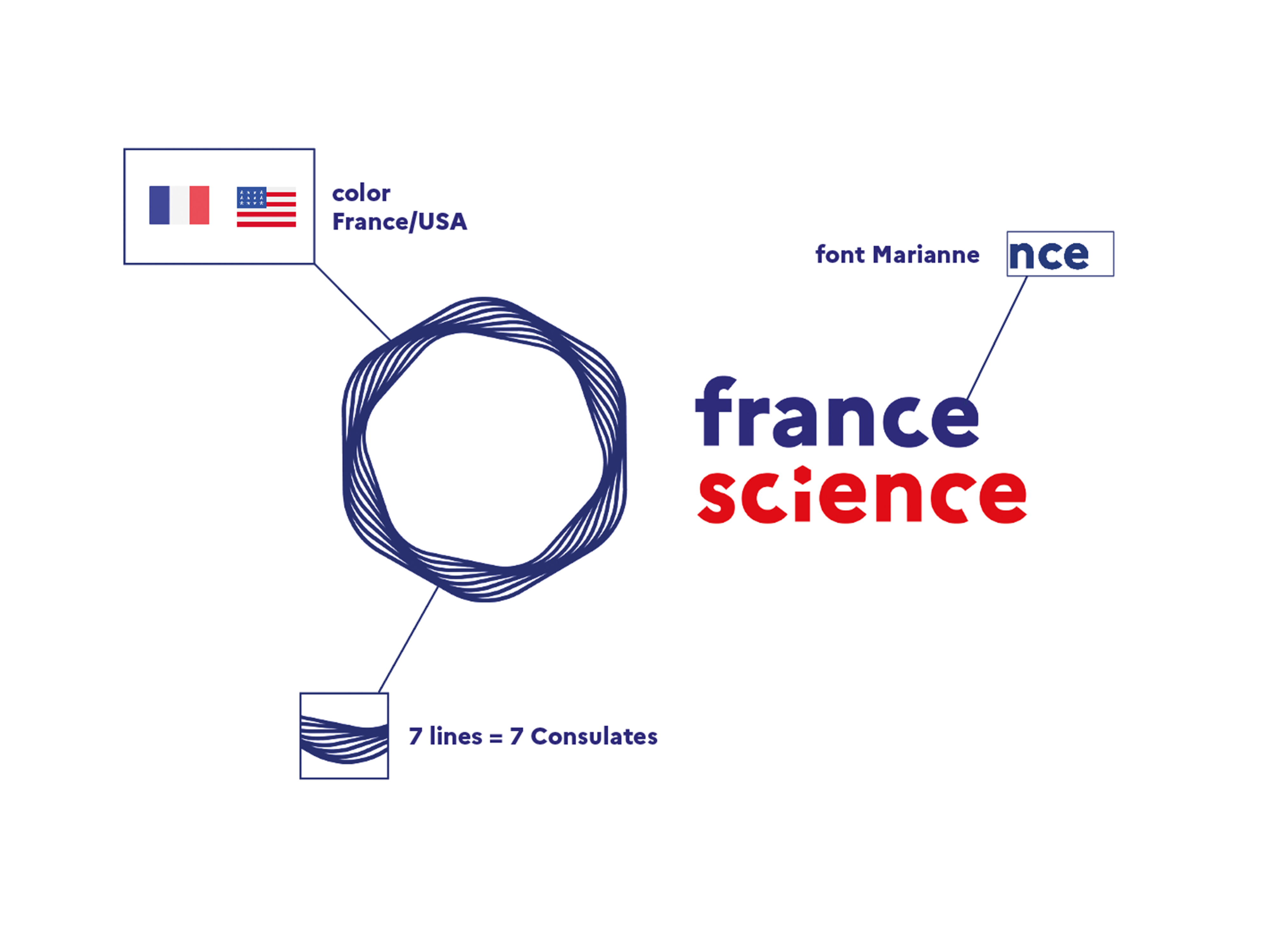
Logo Construction
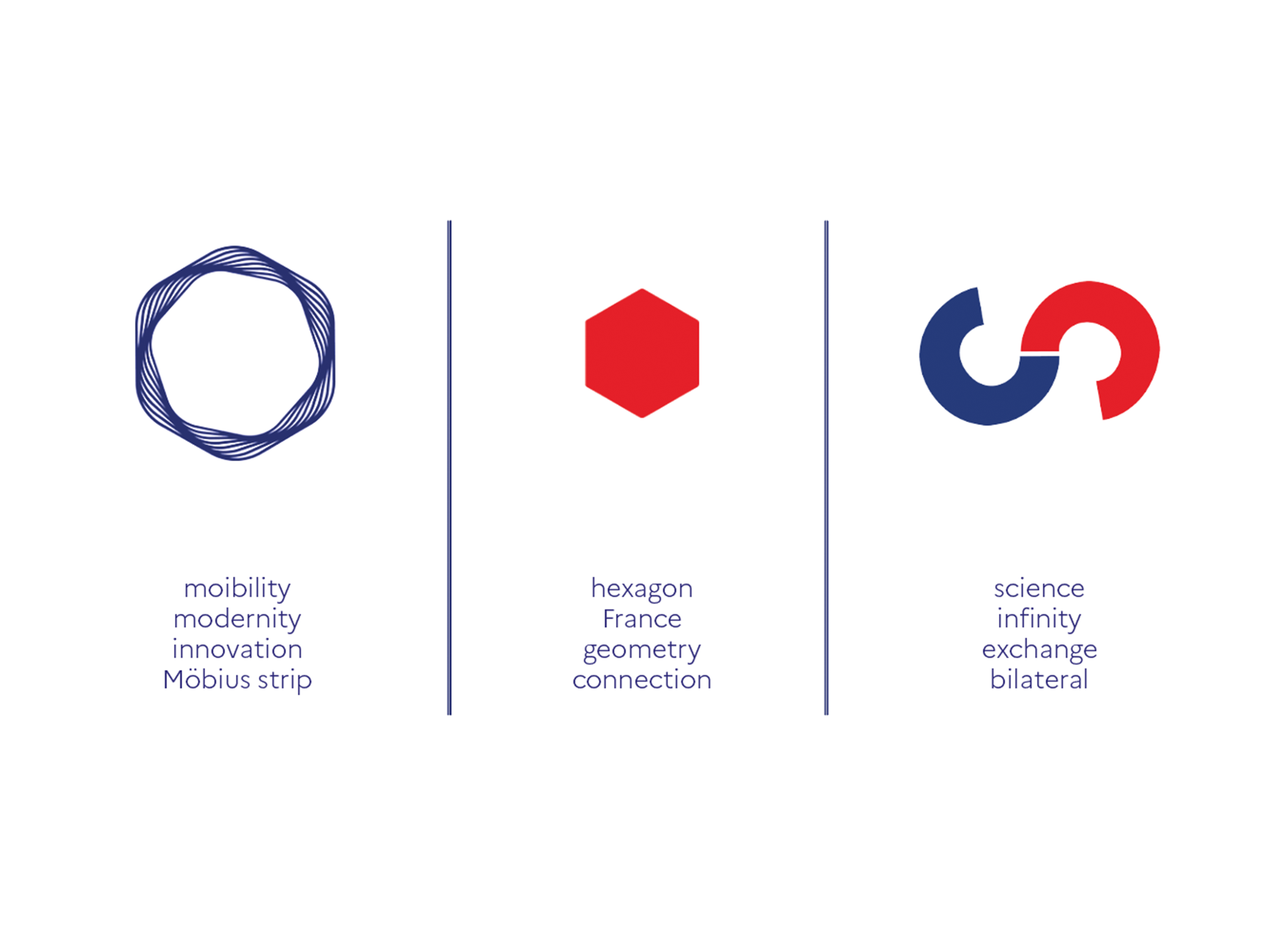
Logo Explanation
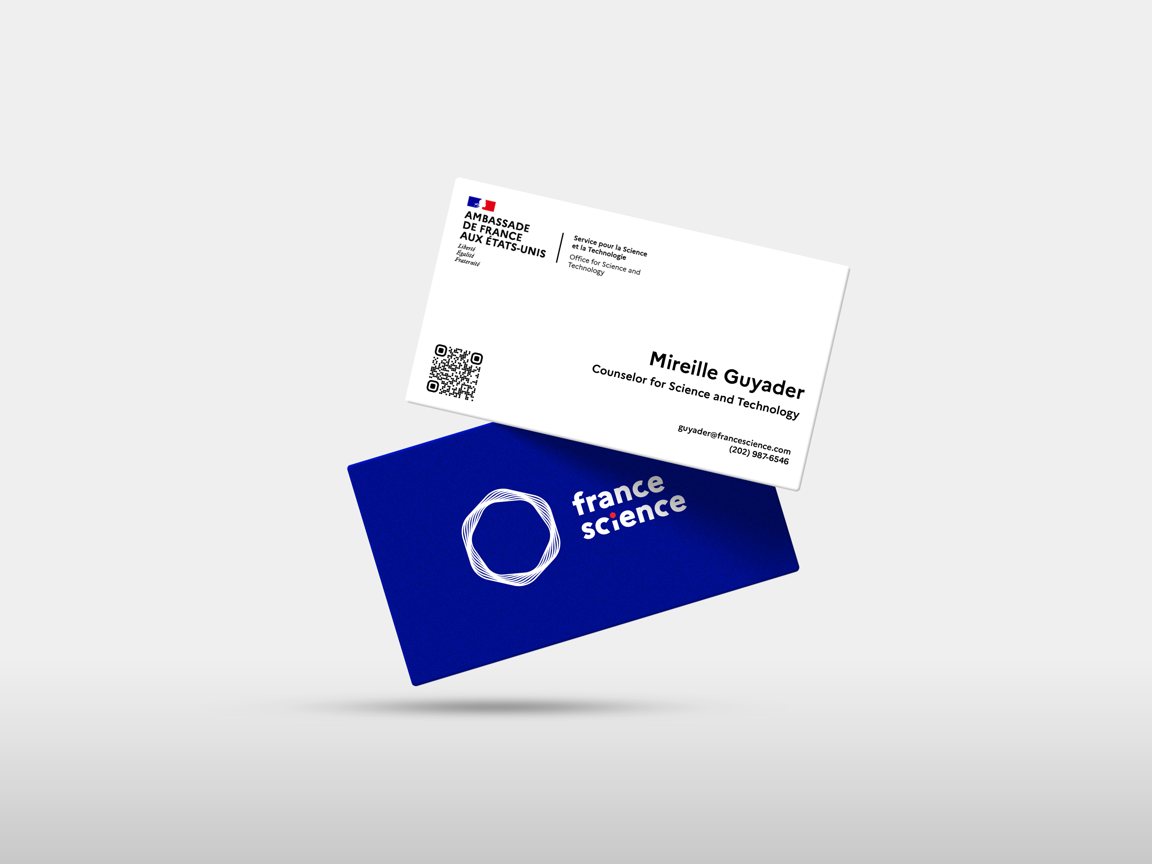
Business cards
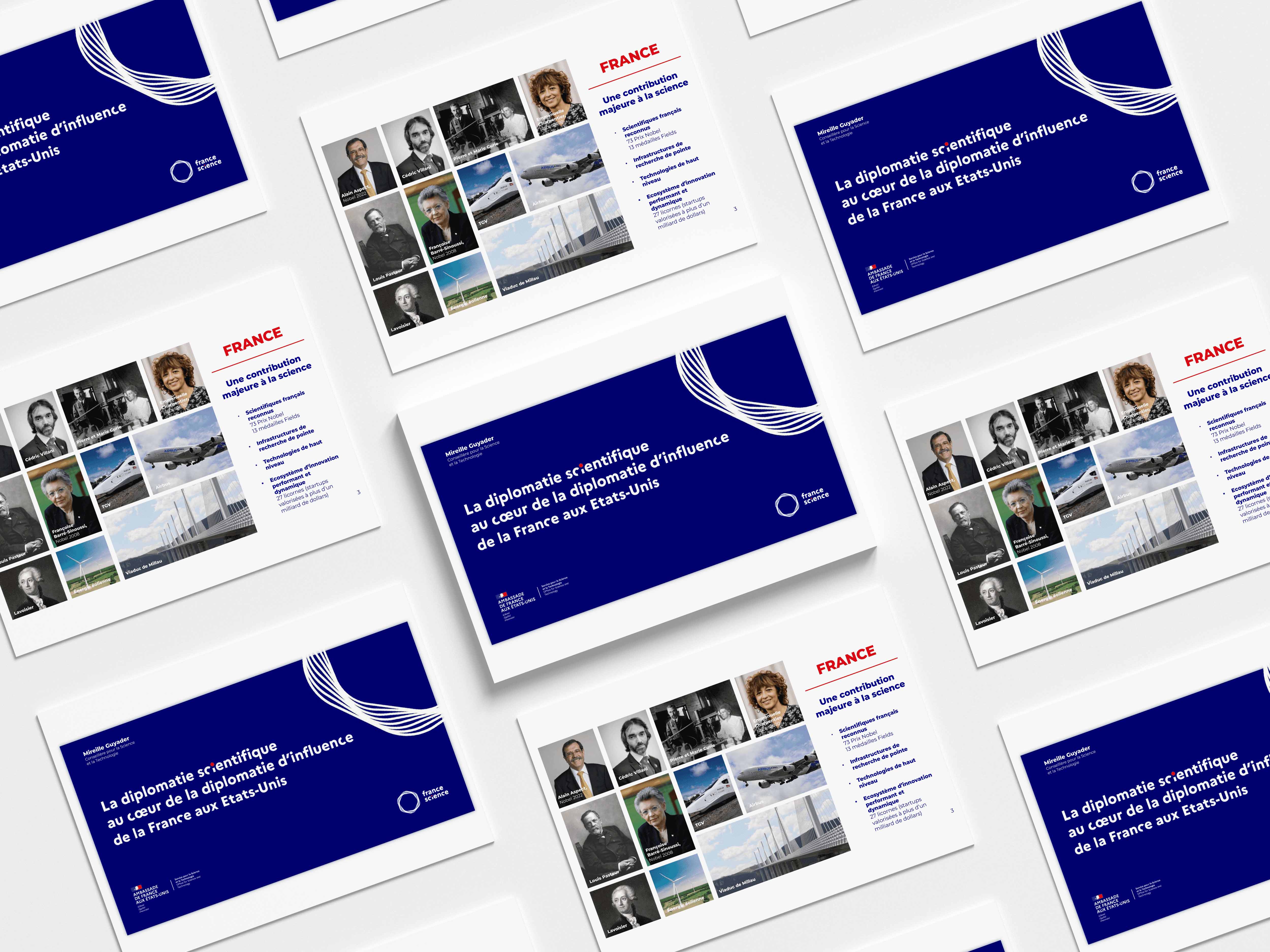
Powerpoint presentation
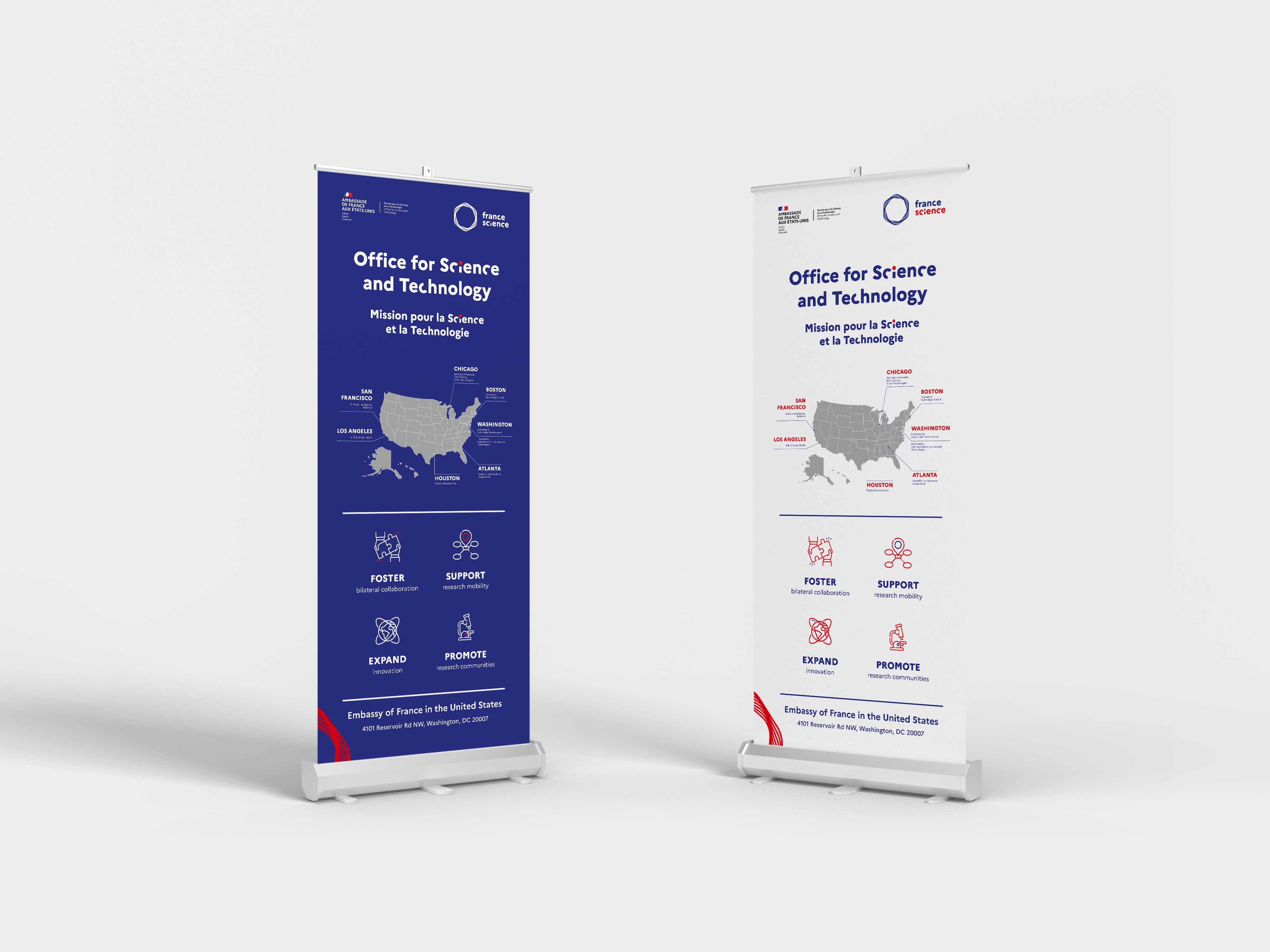
Bannerstands
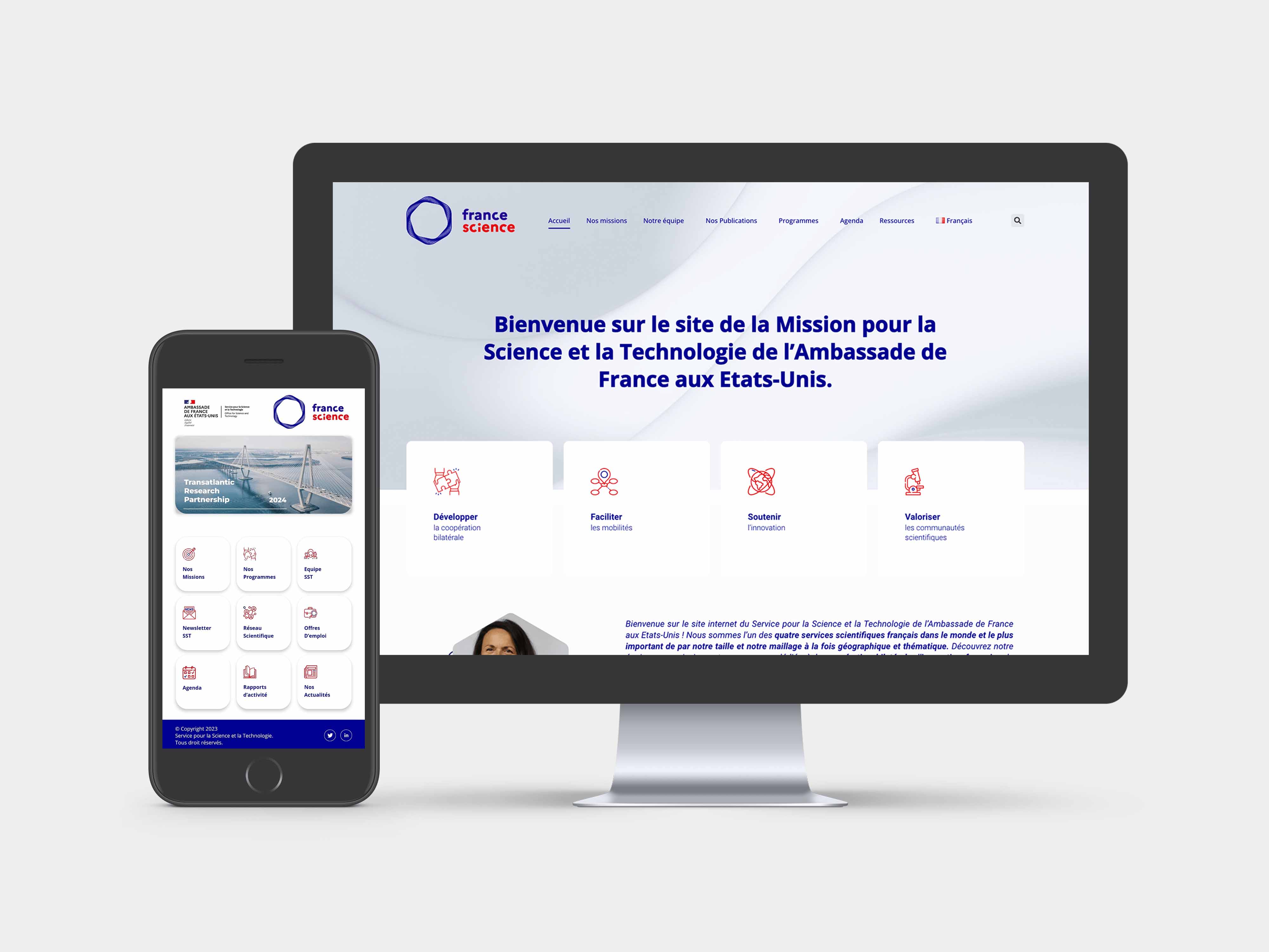
Website (Design on Adobe Xd and weekly maintenance on Wordpress) & Android Application
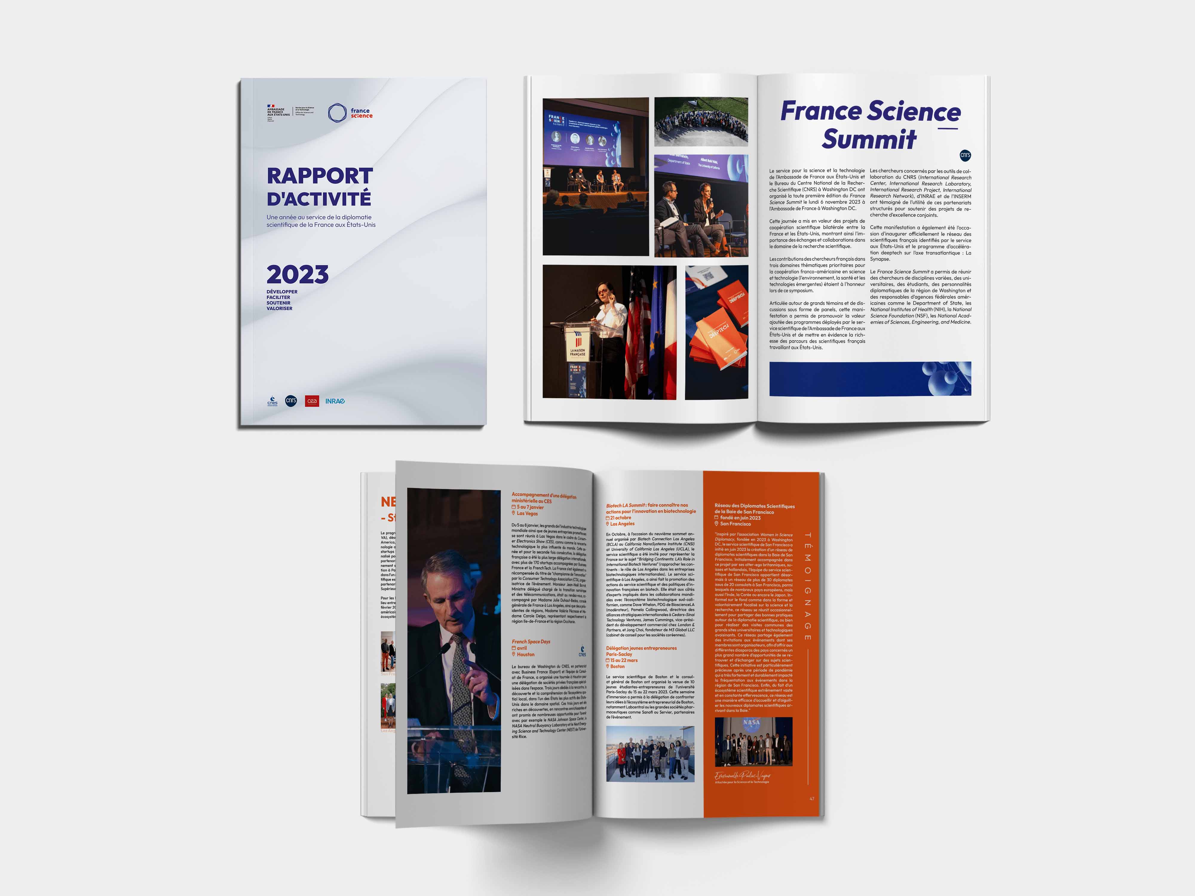
Activity report 2024 (Indesign - 64 pages)
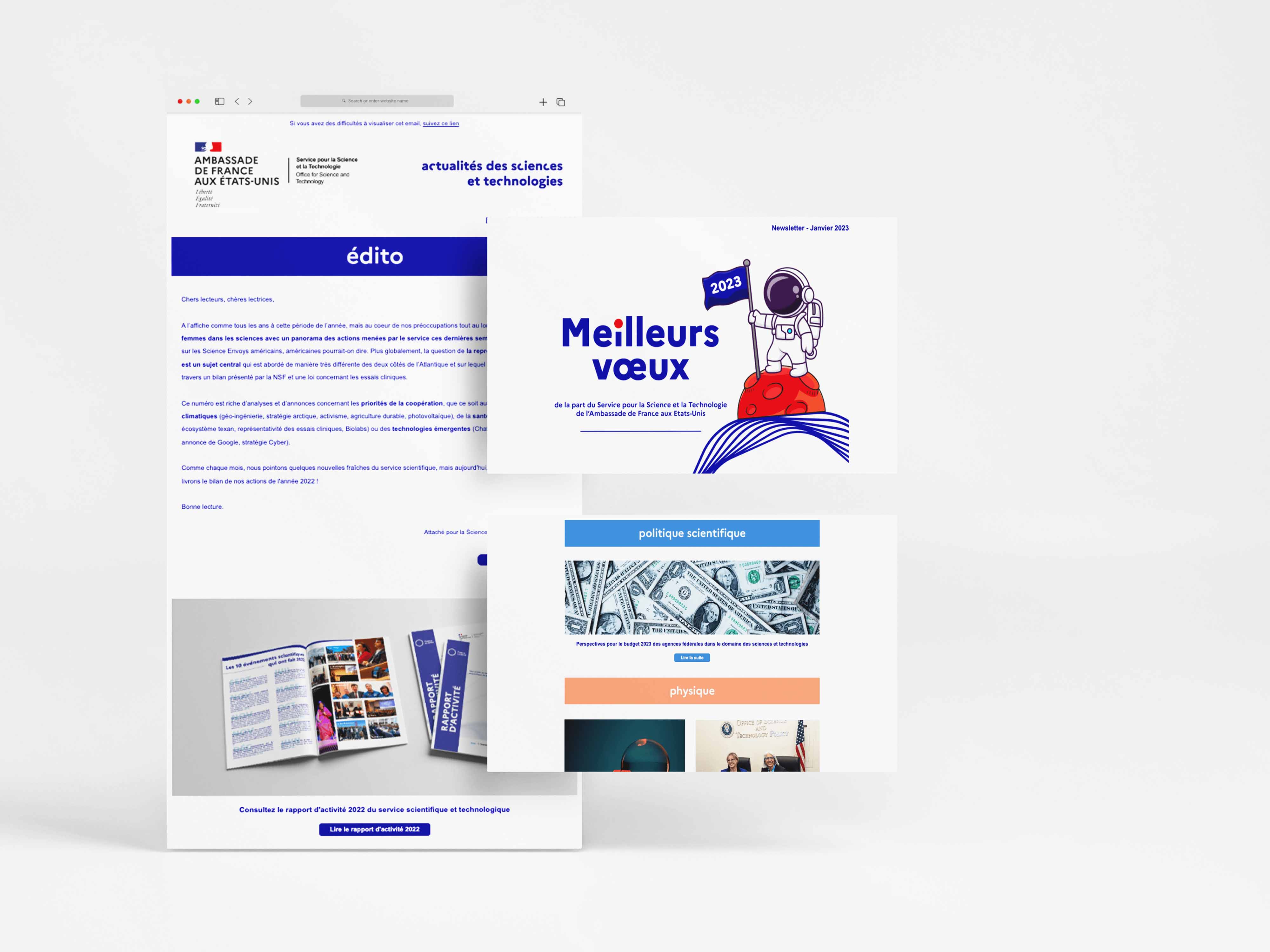
Monthly newsletter (Sarbacane)